Historical Stock Price Analysis
Project Information
- Category: Data Analytics / Financial Analysis
- Client/Context: Quantum Analytics/Investment Analysis & Market Research
- Project Date: December 2023
- Tools Used: Power BI (Power Query, DAX)
- Data Source: Historical Stock Prices (2015-2021) for 10 Popular Companies <<<<<<< Updated upstream <<<<<<< Updated upstream <<<<<<< Updated upstream
- Project URL: View Live Dashboard =======
- Project URL: View Live Dashboard ( available soon ) >>>>>>> Stashed changes =======
- Project URL: View Live Dashboard ( available soon ) >>>>>>> Stashed changes =======
- Project URL: View Live Dashboard ( available soon ) >>>>>>> Stashed changes
Historical Stock Price Analysis: Growth, Volume, and Volatility of Top Companies (2015-2021)
Summary
This Power BI project analyzes the daily historical stock prices for 10 popular companies (Apple, Amazon, Netflix, Microsoft, Google, Facebook, Tesla, Walmart, Uber, and Zoom) from 2015 to 2021. The dashboard offers comprehensive insights into each company's stock price growth, trading volumes, and volatility. It leverages Open, High, Low, Close (OHLC), Volume, and Adjusted Close prices. The project involved extensive data cleaning and transformation to ensure accurate time-series analysis and enable comparisons between companies. Through interactive visualizations, this analysis aims to empower investors, financial analysts, and market enthusiasts with a clear understanding of these companies' stock performance and market dynamics over a significant period.
1. Introduction: Navigating the Dynamics of Top Company Stocks
Understanding the historical performance of leading companies is crucial for informed investment decisions and market analysis. This project focuses on a daily stock price dataset for 10 globally recognized companies from 2015 to 2021. The objective is to conduct thorough exploratory data analysis, compare stock price growth, analyze volume trends, and identify periods of high volatility. By presenting this complex financial data in an intuitive Power BI dashboard, the aim is to provide clear insights into the past performance of these market giants, offering a foundation for future predictions and strategic financial planning.
2. Project Objectives & Goals
The primary objectives for this Power BI project were defined to provide comprehensive insights into the historical stock prices of popular companies:
Overall Objectives:
- To perform robust exploratory data analysis on daily stock prices to uncover trends and patterns.
- To compare stock price growth and volatility across 10 popular companies.
- To lay the groundwork for potential stock price prediction and advanced time series analysis.
- To tell a compelling visualization story about the financial performance of these companies.
Project Goals & Deliverables:
- Overall Market Overview: Display key aggregated metrics such as Total Volume, Count of Companies, and No. of Years in the dataset.
- Company-Specific Performance Cards: Highlight individual companies (e.g., Amazon, Facebook, Microsoft, Tesla, Walmart, Apple, Google, Netflix, Uber, Zoom) for easy selection.
- Max of High and Min of Low by Company: Visualize the price range and volatility for each company over the entire period.
- Total Volume by Company: Show the total trading volume for each company, indicating market activity.
- Total Volume by Quarter: Analyze quarterly trading volumes to identify seasonal or period-specific trends.
- Sum of Volume by Year and Company: Compare how trading volumes for each company evolved annually.
- Average Open by Year and Company: Track the average opening price trend for each company over the years.
- Interactive Year Filter: Allow users to filter the data by specific years.
3. Data Scope & Metrics
The analysis utilized a daily-level dataset of historical stock prices for 10 popular companies from 2015 to 2021.
Data Source:
- Historical Stock Price Dataset: Contains daily stock prices for Apple, Amazon, Netflix, Microsoft, Google, Facebook, Tesla, Walmart, Uber, and Zoom.
- Period: 2015 to 2021 (day level)
- Key Columns:
- Date
- Open (Opening price)
- High (High price of the day)
- Low (Low price of the day)
- Close (Closed price of the day)
- Volume (Amount of stocks traded)
- Adj[usted] Close (Adjusted closing price, accounting for corporate actions)
Key Data Points & Metrics Captured and Displayed:
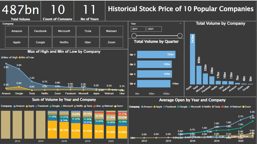
- Total Volume: 487bn
- Count of Companies: 10
- No of Years: 11
- Max of High and Min of Low by Company: Shows Amazon with the highest peak (3.8K) and also a significant volatility range, followed by Tesla. Others like Walmart, Uber, Zoom show smaller ranges.
- Total Volume by Company: Apple (243bn), Microsoft (90bn), Tesla (53bn), Facebook (39bn), Netflix (17bn), Uber (15bn), Walmart (7bn), Amazon (4bn), Zoom (3bn), Google (2bn).
- Total Volume by Quarter: Q1 (132bn), Q2 (120bn), Q3 (120bn), Q4 (115bn)
- Sum of Volume by Year and Company: Visualizes annual volume contribution per company, showing shifts over time.
- Average Open by Year and Company: Shows a clear upward trend in average open prices for most tech companies (Apple, Microsoft, Google, Amazon, Tesla) over the years, while Walmart's growth is more modest.
Key Insights Derived from Data:
- Tech giants like Apple, Microsoft, Amazon, Google, and Tesla show significant stock price growth and volatility over the 2015-2021 period, particularly Tesla with its high peak prices.
- Apple and Microsoft exhibit exceptionally high trading volumes, suggesting high liquidity and investor interest.
- Despite having high stock prices, Amazon and Google show comparatively lower total trading volumes than Apple and Microsoft, indicating different trading patterns or share structures.
- Quarterly trading volumes are relatively consistent, with Q1 showing the highest activity, which could indicate seasonal investor behavior or reporting cycles.
- The "Max of High and Min of Low" chart effectively illustrates that companies with rapid price appreciation (e.g., Tesla, Amazon) also experienced substantial price swings, indicative of higher risk but potentially higher returns.
- Walmart, a more established retail company, shows more stable and modest growth compared to the technology and electric vehicle companies in the dataset, reflecting different industry dynamics.
- Zoom and Uber, newer public companies in this dataset, show their emergence and growth within the later years of the period, reflecting their rapid adoption.
4. Dashboard Design & Key Insights
The "Historical Stock Price of 10 Popular Companies" dashboard is designed to provide a comprehensive and interactive analysis of stock market performance.
Dashboard Features and Key Insights:
4.1 Executive Summary & Key Performance Indicators (KPIs)
Prominent KPIs at the top provide an immediate overview of the dataset:
- Total Volume: 487bn
- Count of Companies: 10
- No of Years: 11
4.2 Company Performance & Volume Analysis
- Company Selection Cards: Individual cards for each of the 10 companies (Amazon, Facebook, Microsoft, Tesla, Walmart, Apple, Google, Netflix, Uber, Zoom) act as filters, allowing users to focus on a single company's performance.
- Max of High and Min of Low by Company (Area Chart): This chart visually represents the price range for each company, highlighting volatility. Companies like Amazon and Tesla show wide ranges, indicating significant price swings, while Walmart has a narrower, more stable range.
- Total Volume by Company (Bar Chart): Ranks companies by their total trading volume, with Apple and Microsoft leading significantly, indicating high liquidity and investor interest.
- Total Volume by Quarter (Bar Chart): Breaks down total trading volume by quarter, showing relatively consistent activity across quarters, with Q1 slightly higher.
- Sum of Volume by Year and Company (Stacked Bar Chart): Illustrates the annual contribution of each company to the total trading volume, showing how the market activity for individual companies evolved over time.
4.3 Price Growth Trends
- Average Open by Year and Company (Line Chart): This chart demonstrates the upward trend in average opening prices for the tech and EV companies (Apple, Microsoft, Google, Amazon, Tesla), reflecting their strong growth during the period. Walmart shows a more gradual increase.
4.4 Interactive Filtering
- Year Slicer: Allows users to filter the entire dashboard by selecting specific years from 2011 to 2021, enabling focused time-period analysis.
The interactive elements and clear visualizations empower investors and analysts to conduct deep dives into company performance, compare growth trajectories, and assess risk and liquidity across the selected popular stocks.
5. Technical Approach & Tools
The project involved robust data cleaning and transformation to handle daily stock market data, followed by comprehensive analysis in Power BI:
- Data Acquisition & Ingestion: Daily historical stock price data for the 10 popular companies (Apple, Amazon, Netflix, Microsoft, Google, Facebook, Tesla, Walmart, Uber, Zoom) was imported into Power BI Desktop. Crucially, the data for each individual company was imported as a folder, and then all 10 separate company datasets were appended into a single, unified table within Power Query. The dataset included Date, Open, High, Low, Close, Volume, and Adj[usted] Close for the period 2015 to 2021.
- Data Cleaning & Transformation (Power Query in Power BI): Power Query Editor was essential for preparing the dataset:
- Date Parsing: Ensured the 'Date' column was correctly parsed to a date data type, crucial for time-series analysis.
- Data Type Standardization: Verified and set appropriate data types for numerical columns (Open, High, Low, Close, Volume, Adjusted Close) to ensure accurate calculations and avoid aggregation errors.
- Handling Missing Values/Inconsistencies: Addressed any potential nulls or irregularities in the daily stock price data.
- Feature Engineering for Time Intelligence: Created additional time-based columns like 'Year' and 'Quarter' to facilitate aggregation and filtering by different time granularities, which are crucial for the dashboard visuals like "Total Volume by Quarter" and "Average Open by Year and Company."
- DAX (Data Analysis Expressions) Calculations: DAX measures were created to compute key financial metrics and aggregations:
- Total Volume = SUM('Stocks'[Volume])
- Count of Company = DISTINCTCOUNT('Stocks'[Company])
- No of Years = DISTINCTCOUNT('Stocks'[Year])
- Measures for Max of High, Min of Low per company, Total Volume by Quarter, Sum of Volume by Year, and Average Open by Year were calculated. These often involved CALCULATE with ALL or ALLEXCEPT to correctly aggregate across different dimensions as needed for the visualizations.
- Data Visualization & Dashboarding (Power BI Desktop): The dashboard was designed with a focus on a clear and intuitive representation of global energy trends:
- KPI Cards: For high-level summaries.
- Company Selection Cards: Acting as visual filters for specific companies.
- Area Charts: Effectively show price ranges and volatility (e.g., "Max of High and Min of Low by Company").
- Bar Charts: Used for comparing volumes across companies and quarters.
- Stacked Bar Chart: To illustrate annual volume contributions by company.
- Line Chart: For visualizing average open price trends over time for each company.
- Year Slicer: For interactive temporal filtering.
- Publishing & Sharing (Power BI Service): The final interactive report was published to the Power BI Service, enabling wider access and sharing with investment professionals and enthusiasts.
6. Impact & Business Value
This Power BI dashboard for Historical Stock Price Analysis delivers significant value to various stakeholders:
- Informed Investment Decisions: Provides a clear, data-driven view of past performance, helping investors understand individual company growth trajectories, volatility, and market trends.
- Competitive Benchmarking: Enables direct comparison of stock price growth and trading volumes between leading companies, offering insights into relative market positions and investor interest.
- Risk Assessment: The 'Max of High and Min of Low' chart helps in quickly assessing the historical volatility of each stock, a key factor in risk management.
- Foundation for Predictive Analytics: The robust time series analysis and data preparation lay excellent groundwork for more advanced tasks like stock price forecasting.
- Market Trend Understanding: Helps in identifying broader market trends, such as the significant growth in tech stocks during the 2015-2021 period.
- Enhanced Data Literacy: Provides a user-friendly interface for financial data, making complex stock market information accessible to a wider audience.
- Demonstration of Financial Data Handling: Showcases expertise in handling granular, daily financial data, performing relevant calculations (e.g., adjusted close), and presenting it effectively.
7. Conclusion
This Power BI project successfully delivers a comprehensive and interactive analytical tool for exploring the historical stock prices of 10 popular companies. By meticulously cleaning, transforming, and visualizing daily stock data from 2015 to 2021, the dashboard offers critical insights into individual company performance, comparative growth, trading volumes, and volatility. This analysis serves as an invaluable resource for investors, financial analysts, and market enthusiasts seeking to understand the dynamics of these market leaders and inform future investment strategies.